November 20, 2012
11/20/2012
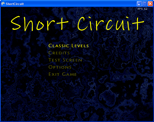
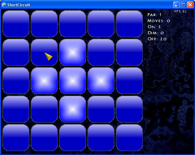
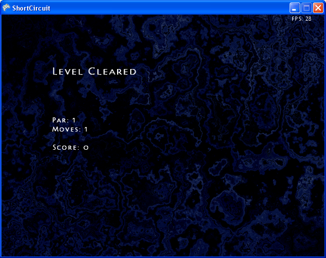
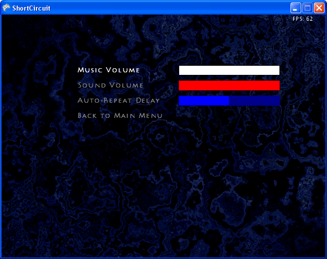
So much done in such little time. Actually, the updates for today have actually been in the works for a few days but just weren’t finished when I posted last. The project is looking a lot more like a real game every day, but without further ado, let’s get on with the changes. One of the largest changes completed today doesn’t really involve a lot of graphical changes, but dealt directly with game input. The game is intended to target the XBox 360 platform but until now it relied heavily upon a mouse because of developmental testing. In today’s update I’ve completely removed all mouse support. Instead of mouse support, I’ve recoded every existing screen to track the player’s current location visually. For instance, on the main menu, the current menu option is highlighted in a brighter color. On the game grid screen, it displays a small cursor to show the player which button they are currently working with. The next major change was the addition of an options screen. With yesterday’s addition of music and sound, I realized the player would need a way to change the volume aside from using their Television remote. As you’ll note from today’s screenshots I’ve provided means for adjusting the volumes for music and sound effects seperately. Also on the options screen, you will notice an Auto-Repeat Delay. I added this option in so the player can hold down a button or direction and have it repeated. If you are on the menu, and you hold down, you will step slowly down the menu continuously. This new option will allow the player to speed up or slow down the rate that it repeats at. A small thing I know, but I thought it was an important detail to cover. On the grid screen I’ve added a few more textual cues on the right side to let you know how many lights there are left to turn on or off. This is a minor thing, but that part of the screen was looking a bit empty with only Par and Moves being displayed. Finally, the last thing you’ll notice from today’s screenshots is some updated graphics. It’s not much, but it does make it look a lot better. I’ve changed all the fonts to royalty-free fonts, and added a custom background image to all the screens. Currently there’s only one background image, but I do plan on adding more later so there’ll be some variety in the scenery. 


